August 16, 2007
What amphibians can be found in your local biome?  What is the range of a particular amphibian, say the Great Plains toad? What does that toad look like? How does it sing?
Great source to supplement geography lessons: Amphibiaweb, a special project at the University of California – Berkeley.
Quite student friendly — get to the world map, click on your continent (ooh! kids gotta know what continent they’re on! see social studies TEKS, World geography 4.C, U.S. history 8, World history 11), click on your country, if you’re in the U.S., click on your state. Photos, maps of the range, scientific names, sound recordings of their calls, description, conservation status.
Read the rest of this entry »
Spread the word; friends don't allow friends to repeat history.
 4 Comments |
  Lesson plans, Maps, Natural history, On-line education, On-line learning, Technology in the classroom, TEKS, Texas |
  Permalink
 Posted by Ed Darrell
August 10, 2007
 Slight deviation from my usual practice of featuring the technological marvel of the writing machine of a well-known writer — these writers are not yet well known.
Someone brought in a vintage Smith-Corona typewriter to one of my favorite classrooms, at the Community School in West Seattle. Photographic evidence shows the machine is still in good working order (better than my Royal), and the students have already figured out how to make it work (see photo below).
My typing career began with my mother’s and father’s Royal, similar to the one I now own. It got me to ninth grade with no problems. I took typing classes on the classic, newsroom Underwoods, about the time that the IBM Selectric was making in-roads. In my senior year of high school I got an Underwood portable — brother Dwight was selling for Underwood-Olivetti. Later I got an old, junked Olivetti electric that was gray, would do line-and-a-half as well as double spacing, and which had a pitch somewhere between 10 and 12 pica. It was heavy and industrial, but the typeface was so readable that it was popular with my debater colleagues — we used to carry the machine with us to tournaments after I joined the college debate squad.
In my junior year at the University of Utah, on a Thomas J. Watson, Jr., Memorial scholarship from IBM, I purchased a Correcting Selectric II (no, IBM offered no discount). About 20 years later, tired of the massive repair bills and hoping word processors would forever banish it from our house, my wife donated that typewriter to the Salvation Army. I found another at a garage sale, and got it for $10.00. The mechanism on that one sprang out of the case about a year later, and we eventually donated it, too.
Perry W. Buffington found the Royal that graces my home office now, largely unused but full of sentiment. (I think Buff wanted me to write more.)
These kids in Washington — they don’t know the value of the tool they have. They can’t know. Lucky kids.

Photo from the Living Classroom; work product from a student.
Spread the word; friends don't allow friends to repeat history.
4 Comments | Brain learning, Classroom technology, Education, Pedagogy, Technology, Technology in the classroom, Typewriters | Permalink
Posted by Ed Darrell
August 7, 2007
How does your state rank in terms of “structurally deficient bridges?” You can get a per capita report and comparison at this site chock full of statistics comparing states: Statemaster.com.
| Rank |
States |
Amount (top to bottom) |
| #1 |
Oklahoma: |
21.331 per 10,000 people |
|
| #2 |
Iowa: |
17.965 per 10,000 people |
|
| #3 |
Nebraska: |
14.828 per 10,000 people |
|
| #4 |
South Dakota: |
13.493 per 10,000 people |
|
| #5 |
North Dakota: |
13.021 per 10,000 people |
|
| #6 |
Mississippi: |
12.67 per 10,000 people |
|
| #7 |
Kansas: |
12.038 per 10,000 people |
|
| #8 |
Missouri: |
9.094 per 10,000 people |
|
| #9 |
Wyoming: |
8.266 per 10,000 people |
|
| #10 |
Vermont: |
7.881 per 10,000 people |
|
| #11 |
Montana: |
6.231 per 10,000 people |
|
| #12 |
West Virginia: |
5.95 per 10,000 people |
|
| #13 |
Alabama: |
5.678 per 10,000 people |
|
| #14 |
Louisiana: |
4.908 per 10,000 people |
|
| #15 |
Arkansas: |
4.904 per 10,000 people |
|
| #16 |
Pennsylvania: |
4.404 per 10,000 people |
|
| #17 |
Indiana: |
3.366 per 10,000 people |
|
| #18 |
Wisconsin: |
3.183 per 10,000 people |
|
| #19 |
South Carolina: |
2.914 per 10,000 people |
|
| #20 |
Kentucky: |
2.815 per 10,000 people |
|
| #21 |
New Hampshire: |
2.802 per 10,000 people |
|
| #22 |
Tennessee: |
2.772 per 10,000 people |
|
| #23 |
Maine: |
2.762 per 10,000 people |
|
| #24 |
North Carolina: |
2.724 per 10,000 people |
|
| #25 |
Ohio: |
2.712 per 10,000 people |
|
| #26 |
Minnesota: |
2.283 per 10,000 people |
|
| #27 |
Alaska: |
2.17 per 10,000 people |
|
| #28 |
Idaho: |
2.148 per 10,000 people |
|
| #29 |
New Mexico: |
2.012 per 10,000 people |
|
| #30 |
Illinois: |
1.913 per 10,000 people |
|
| #31 |
Michigan: |
1.789 per 10,000 people |
|
| #32 |
Rhode Island: |
1.775 per 10,000 people |
|
| #33 |
Oregon: |
1.541 per 10,000 people |
|
| #34 |
Virginia: |
1.534 per 10,000 people |
|
| #35 |
Georgia: |
1.432 per 10,000 people |
|
| #36 |
Hawaii: |
1.216 per 10,000 people |
|
| #37 |
Texas: |
1.215 per 10,000 people |
|
| #38 |
New York: |
1.16 per 10,000 people |
|
| #39 |
Utah: |
1.093 per 10,000 people |
|
| #40 |
New Jersey: |
0.98 per 10,000 people |
|
| #41 |
Massachusetts: |
0.975 per 10,000 people |
|
| #42 |
Connecticut: |
0.966 per 10,000 people |
|
| #43 |
Colorado: |
0.855 per 10,000 people |
|
| #44 |
California: |
0.805 per 10,000 people |
|
| #45 |
Maryland: |
0.745 per 10,000 people |
|
| #46 |
Washington: |
0.693 per 10,000 people |
|
| #47 |
Delaware: |
0.498 per 10,000 people |
|
| #48 |
District of Columbia: |
0.345 per 10,000 people |
|
| #49 |
Arizona: |
0.286 per 10,000 people |
|
| #50 |
Nevada: |
0.257 per 10,000 people |
|
| #51 |
Florida: |
0.178 per 10,000 people |
|
| |
Weighted average: |
4.3 per 10,000 people |
|
DEFINITION: Number of bridges which are structurally deficient. Per capita figures expressed per 10,000 population.
SOURCE: U.S. Department of Transportation, Federal Highway Administration, National Bridge Inventory: Deficient Bridges by State and Highway System, Washington, DC: 2004 via StateMaster
This site has oodles and oodles of great statistics, and a few tools to pull them out and compare. I have not even scratched the surface of utility for the site.
Welcome to StateMaster, a unique statistical database which allows you to research and compare a multitude of different data on US states. We have compiled information from various primary sources such as the US Census Bureau, the FBI, and the National Center for Educational Statistics. More than just a mere collection of various data, StateMaster goes beyond the numbers to provide you with visualization technology like pie charts, maps, graphs and scatterplots. We also have thousands of map and flag images, state profiles, and correlations.
We have stats on everything from toothless residents to percentage of carpoolers. Our database is increasing all the time, so be sure to check back with us regularly.
If you are interested in data on an international scale, be sure to check out NationMaster, our sister site and the world’s largest central database for comparing countries.
What other uses can you find?
Spread the word; friends don't allow friends to repeat history.
4 Comments | 1968, History, Libraries, On-line education, On-line learning, Technology, Technology in the classroom | Permalink
Posted by Ed Darrell
August 5, 2007
Only Crook pointed this out in a comment — and it’s neat enough to raise to a headline:
. . . have you seen the U.S. Presidential Speeches Tag Cloud http://chir.ag/phernalia/preztags/ I happened upon a speech by Millard Fillmore, so naturally I thought of this blog. I can’t link you directly to the speech I looked at, which was his 1850 State of the Union Address, (you have to use the slider to get there) but these were the most common words in that speech according to the tag cloud:
appropriations california constitution negotiation pacific ports revenue territory treasury treaty war
Go try it out. It’s a very interesting tool for the visual portrayal of information — visual portrayals that I don’t know how to copy for display here.
For example, notice the arrival of the word “California” in presidential speeches, circa 1848. Note how the word grows over the next few years, but then disappears just prior to the Civil War — what might that suggest to students about events in California, compared to events in the rest of the U.S.? Or, track the word “Constitution” from the earliest speeches/writings listed to the latest. Or track the use of the word “Iraq” in President Bush’s speeches, between 2000 and 2007.
The tool is ahead of its time, a fun device now. The key question is, how should we be using such information?
Chirag Mehta created the program. Browsing his site will give teachers good ideas about what can be done by a decent programmer. Does any school have a programmer to make such things for the classroom? And we’re supposed to be using technology? (Mehta’s stuff may be as good as it looks — see this article about the tag cloud device, in the Wall Street Journal, no less.)
Spread the word; friends don't allow friends to repeat history.
1 Comment | Historic documents, History, On-line education, On-line learning, Politics, Presentations, Student projects, Technology, Technology in the classroom | Permalink
Posted by Ed Darrell
July 31, 2007

This image of Tropical Storm Chantal depicts wind speed in color and wind direction with small barbs. White barbs point to areas of heavy rain. The highest wind speeds, are shown in purple. The data were obtained by NASA’s QuikSCAT satellite on August 1, 2007, as it was just south of Newfoundland, Canada. NASA image
Here in North Texas, most of our classrooms see refugees from coastal storms from time to time — in fact, most schools still have refugees from Hurricane Katrina, or Hurricane Rita. Plus, sitting close to Tornado Alley, everyone understands that weather is no abstraction here. Weather is personal.
Maps of weather offer teachers a good way to make geography personal, too — or at least more relevant. Those little clouds swirling west from the coast of Africa today could be the hurricane that swamps the Texas coast in a couple of weeks.
An e-mail correspondent sent a link to the Weather Channel’s Hurricane Central, suggesting I might want to track storms for my personal safety (Tropical Storm Chantal is far off in the Atlantic, and racing away; no problems from that storm).
Why not have kids track storms in class? The map above, for example, should be a basic foundation for much of Texas history (the explorers and Spanish colonization, for example), for U.S. history (explorers and the slave trade, the Triangle Trade, the Battle of the Atlantic in World War II, and so on). Get students used to using maps to track important and interesting things, and map use will become second nature, as it should be. The Weather Channel and other sources create updates on that basic map several times a day.
What sorts of storms did the explorers face? The slave ships? How big was the storm that shipwrecked Esteban in Texas? What is one likely source of the massive forest blowdown that created the greater Caddo Lake?
Hurricane season runs through October. There should be a lot of grist for the learning mill just in the daily weather reports. You might also use the weather maps in the daily newspaper (most local newspapers will give you a classroom set for a week for under $20.00 under the Newspapers in Education (NIE) project) (NIE offers an interactive quiz on geography weekly, by the way).
Is there any kid who isn’t fascinated by the weather? That’s your hook. Maps are freely available from the Weather Channel site, and from dozens of others.

Caption from NASA: The third tropical depression of the Atlantic hurricane season formed around 11:00 p.m. EDT on Monday, July 30 west of Bermuda. Exactly 12 hours later on Tuesday, July 31, at 11:00 a.m. EDT, the storm strengthened into a tropical storm with sustained winds of 40 mph and higher gusts. At that time, the storm was named Tropical Storm Chantal. Chantal was located near latitude 40.2 north and longitude 62.7 west, about 330 miles (530 km) south of Halifax, Nova Scotia and is moving rapidly toward the northeast near 23 mph (37 km/hr). Chantal is not a threat to the United States.
Save
Save
Save
Spread the word; friends don't allow friends to repeat history.
4 Comments | Geography - Economic, Geography - Physical, Geography - Political, History, Natural history, On-line education, On-line learning, Technology, Technology in the classroom | Permalink
Posted by Ed Darrell
July 30, 2007

Here’s another map animation from the BBC that helps people visualize the stalemate nature of the Western Front of World War I.
If this animation is available in any form for purchase from the BBC for classroom use, I haven’t found it. I do wish the BBC would do a DVD or CD compilation of these animations and make it available at very low cost to teachers (high costs mean schools buy only one copy, which teachers can’t get a chance to see, and consequently won’t integrate into their lesson plans; paradoxically, a low-priced disk would probably earn BBC more money, and certainly would contribute to much more classroom learning).
This would be a good link for individual study at home on the internet. A great lecture could be built around it, if one has internet access live in the classroom and a way to project it.
Spread the word; friends don't allow friends to repeat history.
1 Comment | 1914-1918, Geography - Physical, Geography - Political, History, History video sources, Maps, On-line education, On-line learning, Teaching, Technology, Technology in the classroom, World War I | Permalink
Posted by Ed Darrell
July 19, 2007
Here’s a cool CD ROM on malaria — surely there is some use geography and world history teachers can put to it, yes?

Biology teachers may find it useful, too. Alas, it’s pricey, unless you’re teaching in a developing country.
The disc has 13 interactive tutorials on various aspects of malaria, including control strategies (most relevant to social studies, I think). Perhaps of most use, it’s got 900 images suitable for PowerPoint or other illustration.

At left, click the image to go to a Wellcome Trust animation of the life cycle of the malaria parasite.
Why is it the good stuff is so often expensive, and so often difficult to get for the classroom? It reminds me of Mark Twain’s line about how we value the truth so much — you can tell, because we economize on it so.
Spread the word; friends don't allow friends to repeat history.
Leave a Comment » | History, Science, Technology, Technology in the classroom | Permalink
Posted by Ed Darrell
July 12, 2007
More catching up: 4 Stone Hearth 18 is up over at Clioaudio — a carnival of blog entries on “Archaeology, Biological Anthropology, Linguistics and Social Anthropology.” Some excellent entries, and even a reference back to the Caddoland map I noted a week or so ago.

The entries on use of computers during class are useful. This one seems to have a lot of material for world geography and world history, but it’s stuff any social studies teacher should have available as a resource.
Don’t go blind, as Tom Boswell’s father told him when he turned Tom loose in the Library of Congress’ room on baseball.
Campfire Crowd image copyright by Beej Jorgensen.
Spread the word; friends don't allow friends to repeat history.
Leave a Comment » | Archaeology, Geography - Physical, Geography - Political, History, History and art, Research, Technology, Technology in the classroom | Permalink
Posted by Ed Darrell
July 12, 2007
The Journal of Chemical Education put up on their website a series of videos showing various chemical reactions. They’re cool — go see (did I mention I’m a bit of a chemistry geek, too?). Some of the stuff flames. Some of the reactions explode.
So, where are the history/economics/geography videos?
Big tip of the old scrub brush to Bug Girl.
Spread the word; friends don't allow friends to repeat history.
1 Comment | Science, Technology in the classroom, Video and film | Permalink
Posted by Ed Darrell
July 8, 2007
I’m trying to figure out how to use this amazing spectrum of maps in class.
But, one set can do something good for schools: You can buy a piece of a national forest, and thereby contribute to a fund to help schools. It’s a bit of a crackpot idea, really — selling off the national forests to provide a minuscule amount of money for schools. But there may be some gems of land out there that could be used for . . . decreasing global warming by creating a preserve for trees.
Davey Crockett National Forest, parcels for sale: This map shows land in Texas for sale.
Your local National Forest may be represented, too. Get there before the developers? Not likely — but you can dream, can’t you?
Please be warned, though, I find the site a real memory hog. If you’re running several programs, and you’re memory deficient as I appear to be for this set of maps, be careful.
Seriously, the site offers a variety of maps of public lands under the jurisdiction of the Bureau of Land Management and National Forest Service. Mineral leasing, oil and gas, coal, and other resources are mapped. This affects the western public lands states mostly, but it could be a great source for a geography project on energy or mineral or timber resources for the nation.
What do you think?
Spread the word; friends don't allow friends to repeat history.
Leave a Comment » | Environmental protection, Geography - Economic, Geography - Physical, Geography - Political, Maps, Public education, Technology, Technology in the classroom, Travel | Permalink
Posted by Ed Darrell
July 6, 2007
If you care about such things and have been paying attention here, you may have noted that I do not often post material from my electronic camera. The reason is simple: I’m stuck in the film age.
We have four single-lens reflex cameras, and a couple of other 35mm film-using cameras that served us well for the past 30 years or so. We have some wonderful images, and lots of snapshots. An early experience with electronic images suggested the color might not be as good in purely electronic images, and of course, the detail . . .
Well, I borrowed son Kenny’s Canon PowerShot S70 for the current trip to New Mexico, and I think the results are spectacular. In only one category have I found a flaw: Extreme telephotography.
My thought is that teachers should get a good digital camera for use in creating images for classroom and internet use. No, not the clunky things most schools had that I’ve seen in the past four years — a good Canon or Nikon, or Sony or Fuji or Panasonic, or Kodak. Budget to update every two years or so for the school (the camera I’m shooting with is more than two years old, though).
There’s just no substitute for good images in teaching.

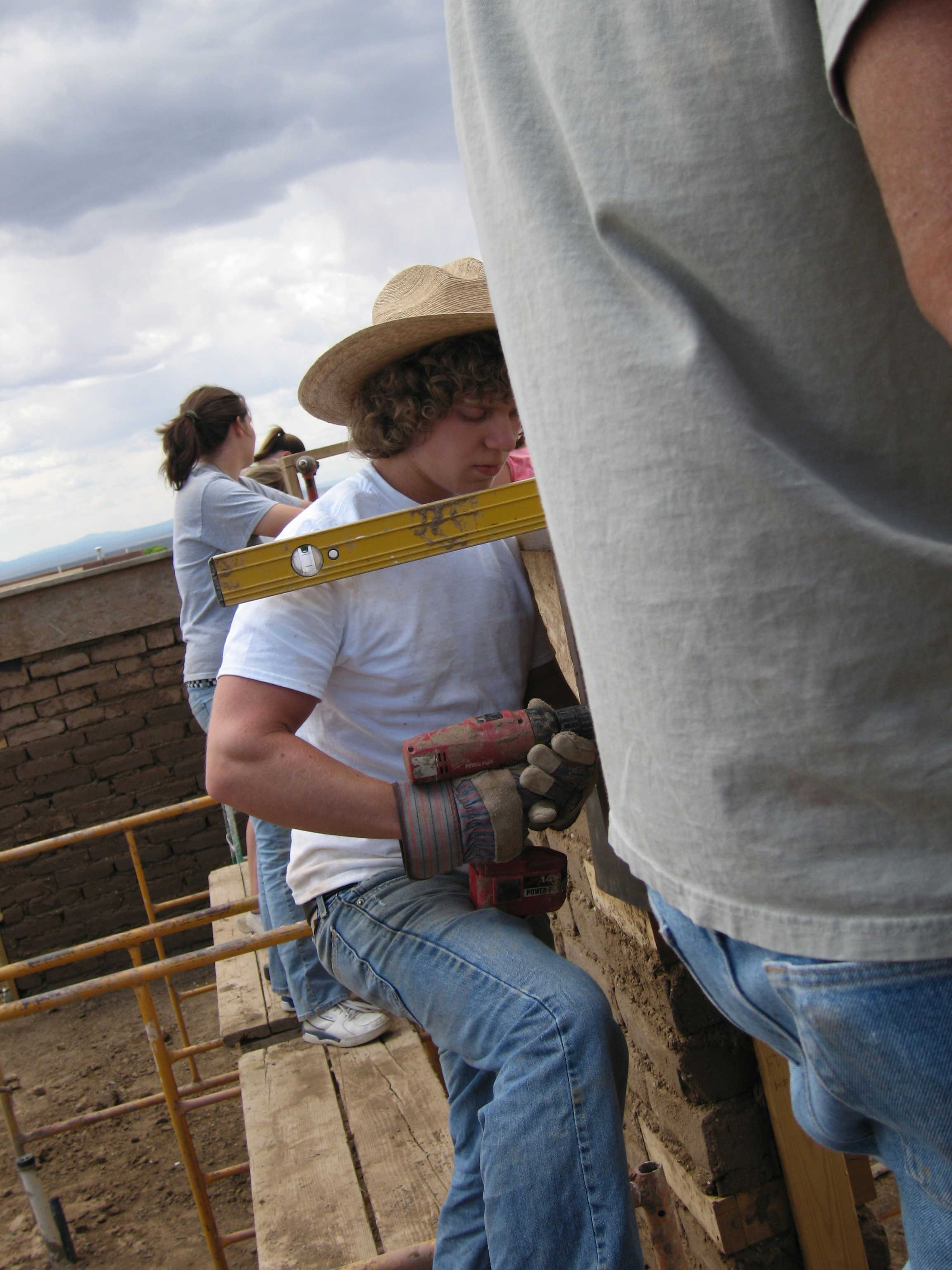
Photo taken 12 hours ago, on July 5, 2007, of student James Darrell applying lessons in building with adobe, in an adobe house under construction in Taos, New Mexico. Photo taken while photographer was balanced precariously atop a ladder and holding concrete forms. Copyright 2007, Ed Darrell
Spread the word; friends don't allow friends to repeat history.
1 Comment | Teaching, Technology, Technology in the classroom, Travel | Permalink
Posted by Ed Darrell
July 5, 2007
This is very, very encouraging.

Here’s what eSchool News says about the archive:
July 1, 2007—Thanks to an online audio archive developed by professors at the University of Pennsylvania, recordings of Ezra Pound or William Carlos Williams can take their places on students’ iPods alongside tunes from Better than Ezra or Carlos Santana. Recordings of these two poets’ works are now available free of charge through PennSound, which features about 200 writers and more than 10,000 recordings contributed by poets, fans, and scholars worldwide. The two-year-old site recently acquired rare readings by Pound, some previously unknown. Hearing any poet “makes the poems easier to move into, in some cases,” said Tree Swenson, director of the Academy of American Poets in New York. “Our ears are less logical than our eyes, somehow.” Pound in particular, she said, “is a perfect example of a poet whose tone and phrasing is so distinctive.” While many web sites stream poetry readings, they require an active internet connection. With PennSound, files are downloadable in MP3 format and can be played offline and on portable devices such as iPods, said Charles Bernstein, an English professor and the site’s co-director.
http://writing.upenn.edu/pennsound
Wow. Ezra Pound may not have a lot of usage in high school classes, but the PennSound site features a lot of commentary by highly-qualified students of literature, and poets. There are good readings of classics by good readers, where the authors were long-dead before audio recording was invented — such as John Richetti reading Pope and Swift.
I think the material is not perfectly catalogued. Go look around the site to see what you can find.
This is wonderfully promising.
And, if you’re looking for poetry read aloud, check out The Poetry Foundation, too: PoetryFoundation.org. That site features the complete text to one of my favorite poems from contemporary poets, “The Shirt,” by the late Jane Kenyon. Her husband, the poet Donald Hall, provided a reading of it for NPR once upon a time (here’s another reading by Hall of the same poem) (Here’s more on Hall as the nation’s Poet Laureate).
Poets reading poetry is often wonderful — take twice daily, repeat for the rest of your life.
Spread the word; friends don't allow friends to repeat history.
Leave a Comment » | Lesson plans, Libraries, Literature, On-line education, On-line learning, Podcasting, Technology, Technology in the classroom | Permalink
Posted by Ed Darrell
June 29, 2007
Looking for good sources on Japanese internment?
Editor & Publisher highlights the web version of a special series on Japanese internment during World War II, put together by the Statesman-Journal in Salem, Oregon. The series is featured in “Pauline’s Picks,” a feature by Pauline Millard showing off the best use of the web by old-line print publications.

The Statesman-Journal’s web piece is “Beyond Barbed Wire,” featuring timelines, maps of the Tule Lake internment facility (closest to Oregon), stories about Japanese Americans in Oregon, especially in Salem, photos, video interviews, and a significant collection of original documents perfectly suited for document-based studies.
Texas kids test particularly badly in this part of U.S. history. Several districts ask U.S. history teachers and other social studies groups to shore up student knowledge in the area to overcome gaps pointed out in testing in the past three years, on the Texas Assessment of Knowledge and Skills (TAKS). In teacher training, I’ve noted a lot of Texas social studies teachers are a bit shaky on the history.
The Korematsu decision was drummed into my conscious working on civil rights issues at the Senate Labor and Human Resources Committee, and complemented by Constitutional Law (thank you, Mary Cheh) and other courses I was taking at the same time at George Washington University. It helped that Utah has a significant Japanese population and had “hosted” one of the internment camps; one of my tasks was to be sure committee Chairman Orrin Hatch was up on issues and concerns when he met with Japanese descendants in his constituencies in Utah. Hatch was a cosponsor of the bills to study the internment, and then to apologize to Japanese Americans affected, and pay reparations.
The internment was also a sore spot with my father, G. Paul Darrell, who witnessed the rounding up of American citizens in California. Many of those arrested were his friends, business associates and acquaintances. Those events formed a standard against which he measured almost all other claims of civil rights violations.
Because children were imprisoned with their parents, because a lot of teenagers were imprisoned, this chunk of American history strikes particular sympathetic chords with students of any conscience. Dorothea Lange’s having photographed some of the events and places, as well as Ansel Adams and others, also leaves a rich pictorial history.
(I found this thanks to the RSS feed of headlines from Editor & Publisher at the Scholars & Rogues site.)
Spread the word; friends don't allow friends to repeat history.
4 Comments | Bill of Rights, Citizenship, Civil Rights, DBQ sources, Education, Freedom - Political, Geography - Physical, Geography - Political, Historic documents, History video sources, Japanese American internment, Justice, Newspapers, Supreme Court cases, TAKS, Teaching, Technology in the classroom, TEKS, U.S. Constitution, U.S. Supreme Court, World War II | Permalink
Posted by Ed Darrell
June 29, 2007
 (Click on thumbnail for a larger view of this Caddoland Collage)
Caddos, Anadarkoes, Tawaconies, Southern Delawares — so many Native American tribes disappear from U.S. history books, and from U.S. history. These histories should be better preserved and better taught.
Texas history texts mention the Caddo Tribe, but largely ignore what must have been a significant cultural empire, if not an empire that left large stone monuments. Teaching this material in Texas history classes frustrates me, and probably others. Student projects on the Caddos are frequently limited in what they cover, generally come up with the same three or four factoids and illustrations.
The Caddo Tribe lived in an area spanning five modern states, Louisiana, Texas, Arkansas, Oklahoma, and eventually Missouri. Here is an interactive map that offers more information and useful photos of Caddoland than I have found in any other source: The Caddo Map Tool.

This is just an image of the tool — click on the image above and it will link to the actual site. One of the things that excites me about this map is its interactive features, especially the map that carries links to photos that show just what the local environment looks like.
Read the rest of this entry »
Spread the word; friends don't allow friends to repeat history.
2 Comments | Archaeology, Geography - Economic, Geography - Physical, Geography - Political, History, Lesson plans, Maps, On-line education, On-line learning, Place Names, Prehistory, Student projects, Teaching, Technology in the classroom, Texas, Texas history, Travel | Permalink
Posted by Ed Darrell
June 28, 2007
The British Broadcasting Company (BBC) puts genius into their website — very often, it seems to me.
Go see this interactive map. It shows where civilizations or religions held sway, at a point in history you decide — and then projects forward to show how the group’s influence waxed and waned. Or plot two different groups, side-by-side.
 Civilisations is a multi-dimensional picture of human history, where you’re in charge of the timeline.
It uses web technology to reveal the sweep of historical forces and the rise and fall of great empires and ideas over 5000 years in a way that no book could ever do.
And it does it your way. You can customise Civilisations to show you the things that interest you. The best way to understand Civilisations is to have a go.
Great bauble for world geography and world history courses — what sort of a warm-up exercise could you make with this, projecting it from your computer? What sort of homework could be made from this, for the kids to access on their own?
Gee, while you’re there, teachers: Take a look at the interactive quizzes on world religions — this could be a unit all to itself. Hook up your computer, take the quizzes as a class, on that rainy day when you were supposed to go out to look at the school’s garden and you need a ten-minute, cultural filler that sticks to the state standards. And look at this multifaith calendar. You can use it for your daily “this day in history” feature; it’s useful for students doing projects on various religions. Use some imagination.
Spread the word; friends don't allow friends to repeat history.
Leave a Comment » | Classroom technology, Communism, Education, Freedom - Political, Geography - Physical, Geography - Political, History, History video sources, Immigration, Maps, Religion, Technology, Technology in the classroom, TEKS | Permalink
Posted by Ed Darrell


